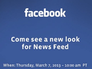

Remember how, exactly one year ago today, Facebook unveiled an overhauled News Feed, which was supposed to highlight things like Photos, news articles, maps and events with new feeds for each type of content?
If you’ve been wondering when you were actually going to get to see this new design, you are not alone. Almost no one got to use it, because it never actually launched. The problem was, to put it bluntly, users kind of hated the new design.
So, after getting feedback from its users, and fixing the problems that they highlighted, Facebook has, once again, unveiled a revamped News Feed. Hopefully this one will work out better than the last one did.
The changes to the News Feed are all visual, and do not affect the way that Facebook gives people content, though the company has been updating that recently as well. In the new design, Facebook has made it so that all images are larger. In addition, both organic stories and ads will be the same size; that is similar, the company says, to the way images appear on mobile.
Overall, the update had made is to that the page now looks cleaner and sleeker, with an emphasis on News Feed content.
Here is a side by side comparison, with the current version of the News Feed on the left, and the new version that users will start to see on the right:

So you might be askin what exactly is the difference between the rejected design and this new one? It seems to mostly do with how they affected the left and right hand columns of the Facebook homepage.
As you can see in the above picture, the columns on the sides of the page have, pretty much, been left alone. Aside from being turned from white to grey in order to highlight the actually feed in the middle, there is no change.
The old update, the one that was rejected by users, had changed the left-hand column to a bunch of different, smaller icons, that kind of made it look like the tool panel on Photoshop. Meanwhile, the content in the middle was made noticably larger.
The right hand side of the screen had been updated to allow users to choose different feeds, including music, which showed what their friends were listening to; photos, which was photos uploaded to Facebook, Instagram or other apps; games; and Following.
This is what it looked like:

The idea was to make the site less cluttered, but it just wound up confusing people.
“People who tested it told us that they liked the bigger photos and images, but found it more difficult to navigate Facebook overall,” Facebook said.
“The updated design has the best of both worlds: it keeps the layout and navigation people liked, but offers bigger images and photos, as well as a new font. The current design on mobile remains the same.”
People should start getting the updated News Feed over the next few weeks.
(Image source: social-media-consultancy.com)